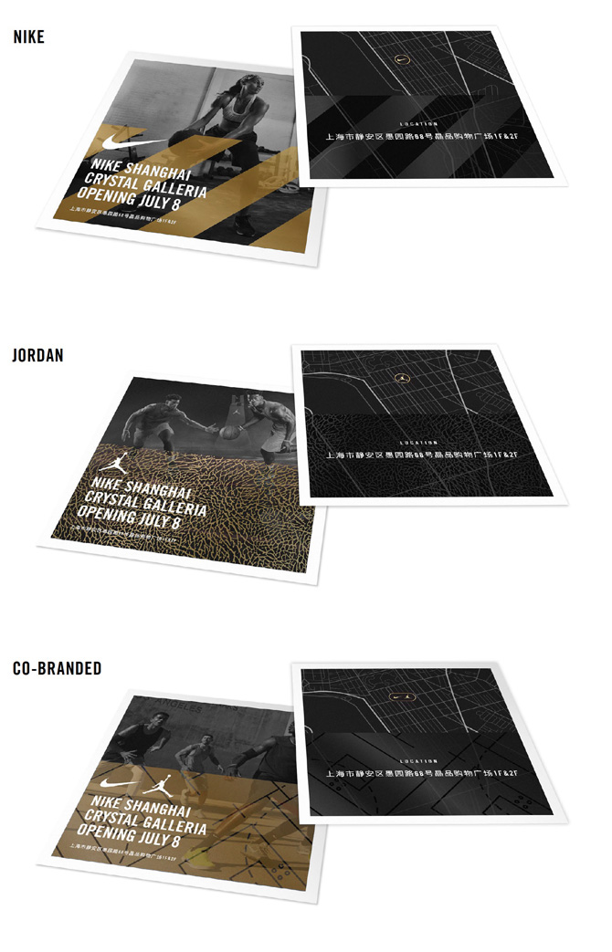
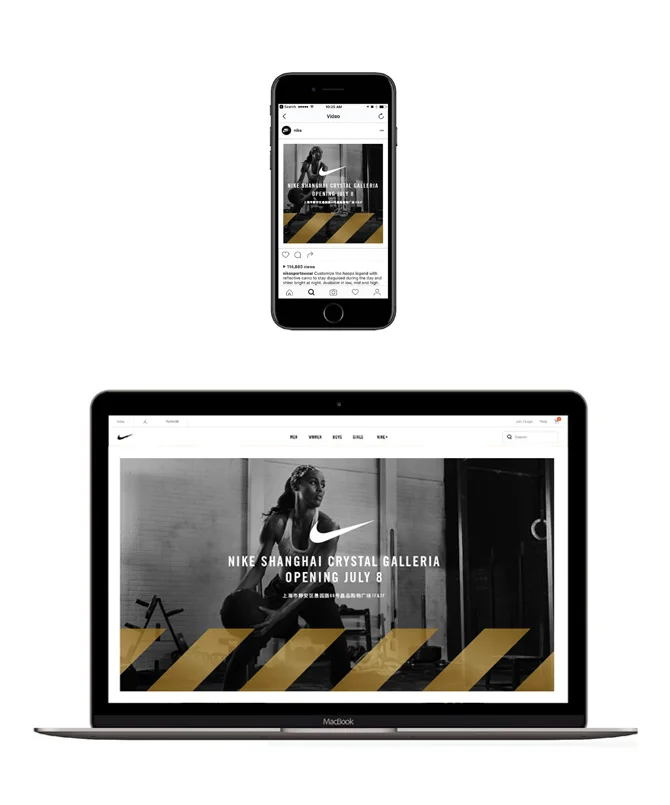
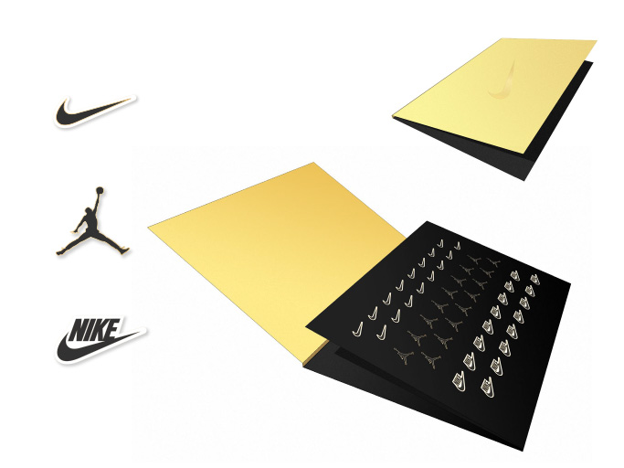
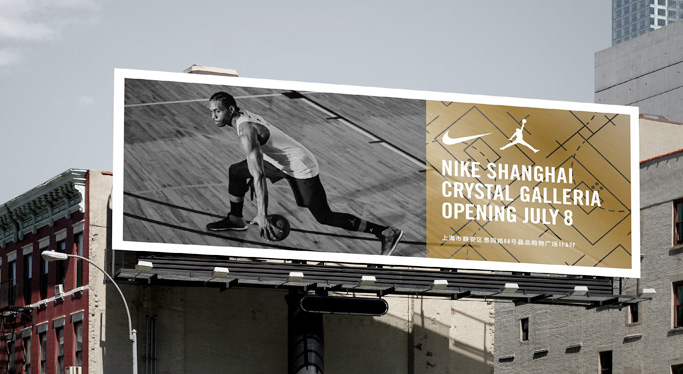
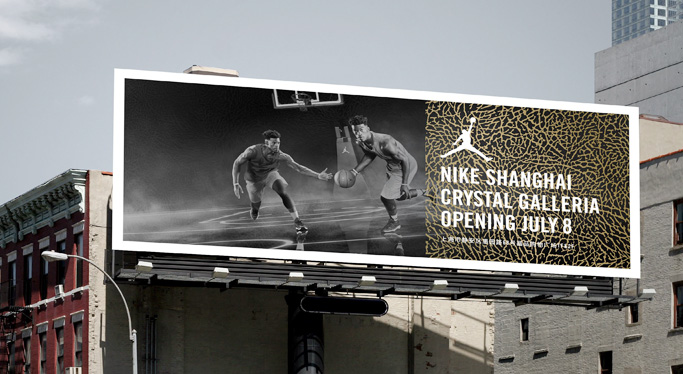
Nike China's brand team came to us for a branding and launch kit design for new store openings in the region. The kit started with the fundamentals: naming, branding, key pattern assets, typography guidelines; and collateral, out-of-home, and digital applications. The regional team decided on gold as the key color to represent Nike as a premium brand to the local audience. The guidelines were formulated into an updatable binder format which went into a larger celebratory kit to be issued at launch. The kit included t-shirt designs, sticker packs, cloissoné pins, printed ribbon, and comparative gold scissors for the opening ceremony. As design lead, I guided the design strategy, provided directed the design team, and served as client-facing design representation.
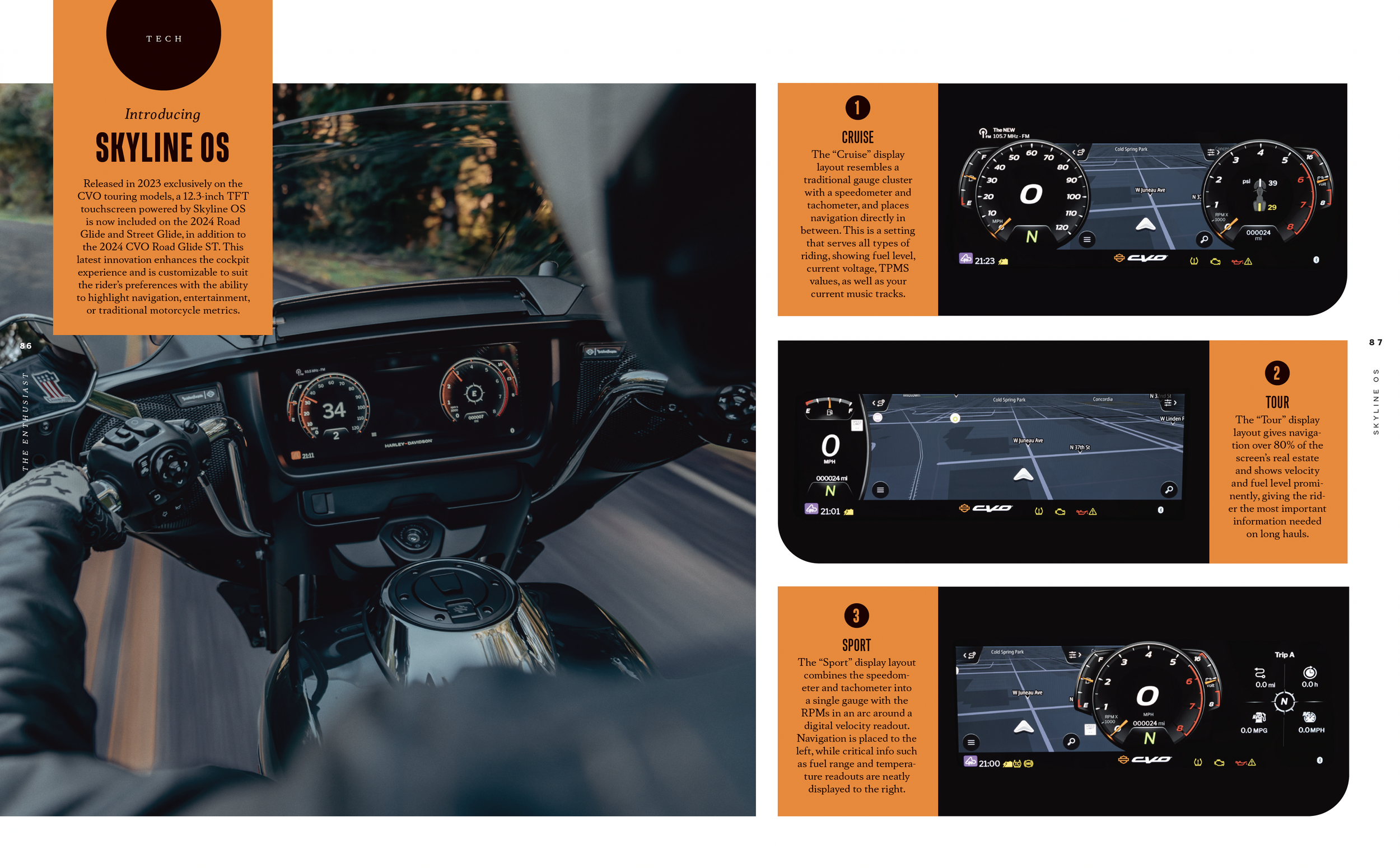
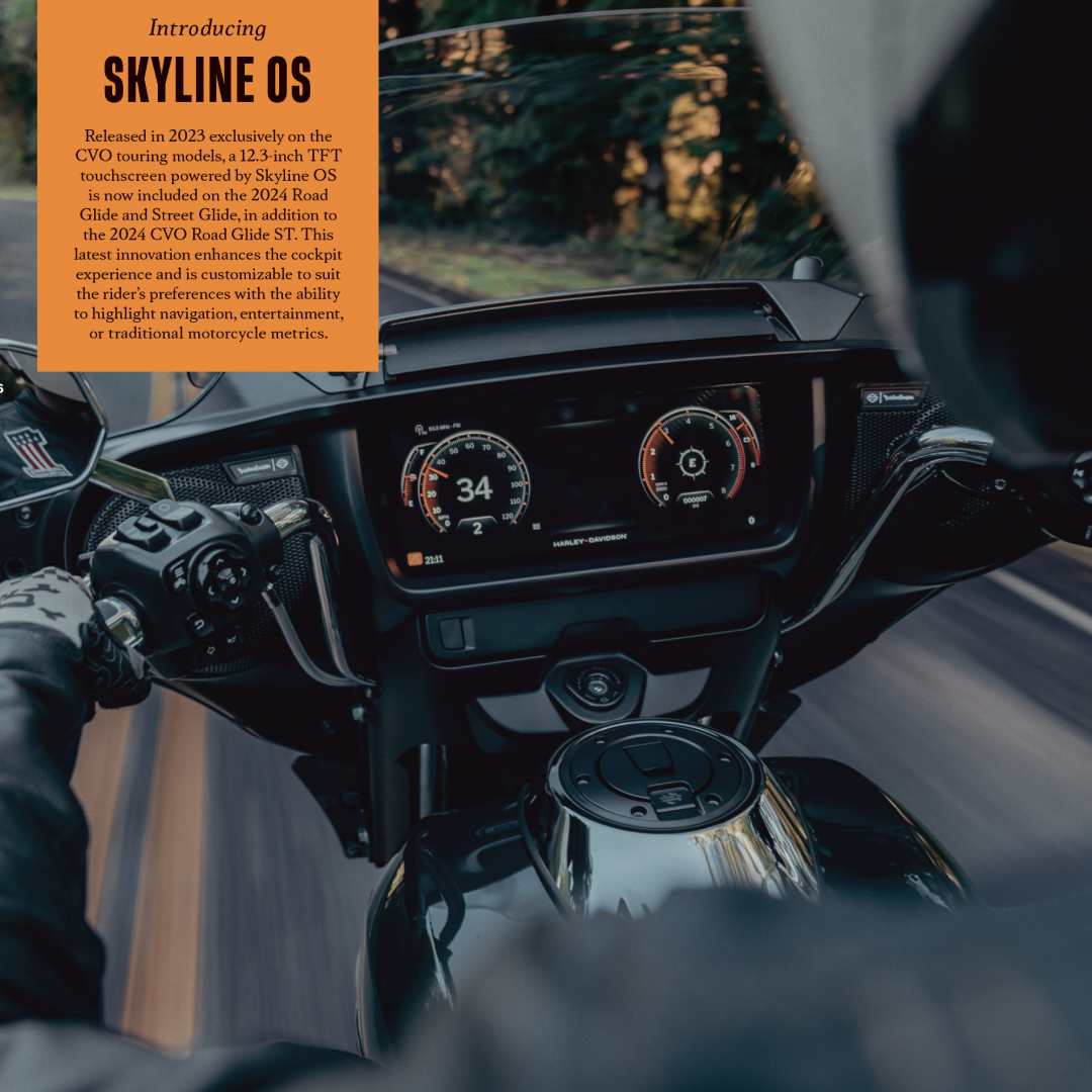
From time to time, I stretch into copywriting and naming work. Harley needed a name for the infotainment and navigation system on our new product platform. I came up with the name Skyline OS, playing on the idea of the horizon that beckons the rider, freedom from the hard wired land line, and the crucial communication lines that we rely on when we travel.